
Appearance
Appearance
InterMIND lets you toggle between light and dark mode from the sidebar, and customize the primary and secondary accent colors used in each mode from the Settings page.
Color Mode (Light / Dark)
Color mode is toggled from the sidebar, not the Settings page:
- Look for the Toggle theme button in the app sidebar (or the sun/moon icon in the header on landing pages)
- Click to cycle between the available modes
The mode follows your system preference by default. Switching dark/light during a meeting is handled separately — the meeting room is always rendered in dark, and sidebars (chat, participants) follow your preference inside it.
Theme Colors
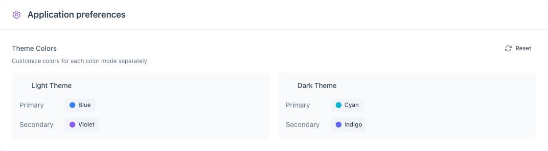
You can customize the primary and secondary accent colors for both light and dark themes independently. This is done from the Application preferences card on the Settings page.
What Can Be Customized
| Setting | Affects |
|---|---|
| Light theme — Primary | Buttons, links, active elements in light mode |
| Light theme — Secondary | Accents, badges, secondary UI in light mode |
| Dark theme — Primary | Buttons, links, active elements in dark mode |
| Dark theme — Secondary | Accents, badges, secondary UI in dark mode |
Changing Theme Colors
- Go to Settings → Application preferences
- Each theme (Light / Dark) shows a Primary and Secondary swatch
- Click a swatch to open the color picker
- Pick a color — the change applies immediately
Resetting Colors
Click the Reset (circular arrow) button at the top of the Application preferences card to restore all four color settings to their defaults.
Syncing Colors Across Devices
Theme colors are stored on your account and follow you across devices when you sign in.